Definition
As humans, we’re hard wired to take the path of least resistance.
Complexity is a turn-off. We like what we can easily understand.
It’s not just about being lazy though. It’s efficiency. It’s survival.
In marketing terms, people engage with your ad, remember your message, and decide whether or not to engage when it doesn’t make their brain hurt.
This isn’t dumbing things down. It’s a mental shortcut.
The world’s complex. Processing simple messages leads to quicker decisions. So we do it. A lot.
In marketing, it translates to ads that get noticed, remembered, and acted upon.
What This Means for Your Marketing
Simple. Cognitive fluency sells. Use it to translate a complex benefit into something digestible and appealing.
Think of it this way: clear product image + simple headline + obvious CTA = more conversions.
Cluttered ads with multiple products, essays for copy, and a confusing CTA text? That’s a recipe for “scroll-past”.
Cognitive Fluency shapes eCommerce ads like this:
- Clear Product Focus: Apple gets it. One iPhone, plain background. Boom.
- Concise Copy: Short headlines. Punchy benefits. No War and Peace here.
- Visual Hierarchy: Eye flow from product to benefit to CTA. Like a visual conveyor belt.
Key Points
- Mental ease promoter: Makes information easier to understand and remember
- Trust builder: Boosts credibility of easy-to-understand information
- Decision accelerator: Helps shoppers make choices more quickly
- Conversion booster: Can increase the chances of users taking desired actions
- Design simplifier: Pushes for clear, straightforward layouts and messaging
- Brand strengthener: Builds positive associations through effortless interactions
Why It Works
- Processing Ease: People like information that’s easy to understand. When an ad is simple, it feels more trustworthy.
- Mere Exposure Effect: Things that are easy to understand feel familiar. We tend to like familiar things more.
- Cognitive Load Theory: When ads are easy to grasp, our brains have more energy left to make buying decisions.
- Heuristic Processing: On social media, people make snap judgments. Simple ads are more likely to stick in memory.
- Truth Effect: Information that’s easy to process often seems more truthful, making simple ads more believable.
- Effort Heuristic: When an ad is easy to understand, people often think the product will be easy to use too.
Real-World Example
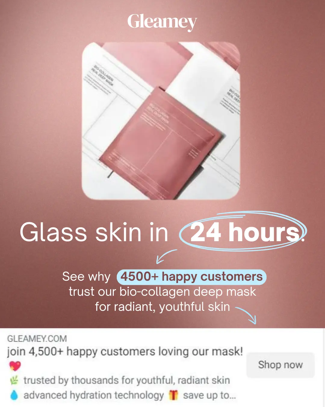
Let’s take a look at this ad from skincare brand GLEAMEY. It uses directional cues (an arrow), bright CTAs. and bold font face to communicate its core message: their mask is the ultimate skincare solution.
Perhaps it’s all you need? Perhaps they’re saying that it’s more effective than all those high-end moisturizers? Or maybe they mean it’s a a complete skincare routine in a simple face mask?
You can see why the core message here needs work. It’s overly vague, and yes it does pique curiosity to some extent, but there’s nothing here to suggest it does anything to particularly capture and hold attention.
And also, the “Shop Now” CTA button is in a weird spot, isn’t it? In western cultures, our brains are hard-wired to read left-to-right, so it’s in a pretty awkward looking spot.
Let’s tune this up, with emphasis on improving Cognitive Fluency. There are a number of ways we can do just that, from using color to signify key messages, to working on the core message takeaway, to making further use of directional cues to help guide the eye.

Hover over the slider below to see the before and after.
Here’s how we might improve Cognitive Fluency:
- Clear Main Benefit: “Glass skin in 24 hours” is a concise, easily understandable primary message, unlike the original ad’s more ambiguous “ultimate skincare solution” claim.
- Temporal Framing: The “24 hours” timeframe lays down a clear expectation, making the benefit more concrete and easier to grasp.
- Visual Hierarchy: The main message is larger and more prominent, guiding the viewer’s attention more effectively. Also check the equal white space around it vs. the original, which looked comparatively scrunched up against the product image.
- Selective Attention: By circling “24 hours” and using arrows to guide the eye to the key social proof statement, and then the actual CTA, we’re highlighting critical elements more effectively.
- Von Restorff Effect: A subtle light blue background to highlight the “4500+ happy customers” statement brings out the social proof.
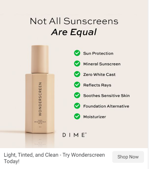
Next up on our Cognitive Fluency hit list, is this ad from another skincare brand, Dime.
Another headline that lends itself to vagueness (the No.1 enemy of Cognitive Fluency), paired with no less than 7 bullet points (it’s asking a lot of your casual ad viewer to process and recall seven things about your value prop).
Hover over the slider below to see the before and after.
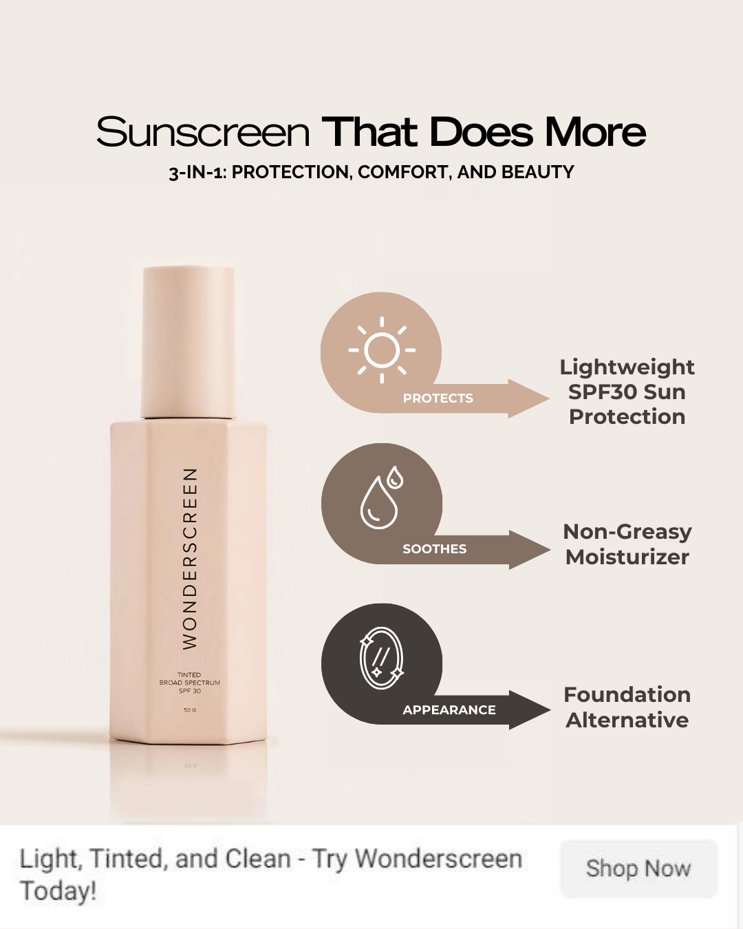
Here’s how we might improve Cognitive Fluency:
- Clear Main Benefit: “Sunscreen That Does More” immediately communicates the product’s unique selling proposition. The original’s “Not All Sunscreens Are Equal” wasn’t a terrible headline, but didn’t really positively frame the benefits of the product. We also added a “3-in-1 Protection” sub-headline to back-up and solidify the headline claim.
- Chunking: Rather than go spell out a long list of bullets, the revised ad concept uses chunking to simplify the overall message into three, more digestable points: protection, comfort, and beauty. The three most relevant bullet points are kept, removing the others.
- Selective Attention: The use of arrows pointing to each bullet point does more to draw the eye than the original’s green tickboxes. Clean icons are also deployed to visually convey the product benefits.
So, which do you prefer?
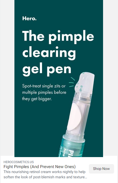
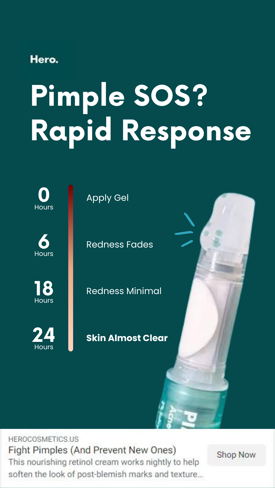
And finally, we have the below 1080×1920 social ad from Hero, promoting their Pimple Gel Pen. It’s a pretty clean ad thorough-out, branding at the top, exaggerated headline, close-up product shot. To be honest, there’s not a lot to improve.
But we’ll give it a shot.
Check out the before and after.
Here’s a quick rundown of what we did:
- Problem-Solution Framing: “Pimple SOS? Rapid Response” clarifies the problem and introduces the solution in just four words, unlike the more descriptive “The pimple clearing gel pen”. Although the original headline isn’t bad, it relies on the ad viewer to make the connection between what the product does and the problem it’s supposed to solve.
- Endowed Progress Effect: Doing away with the copy under the domineering headline, we applied a vertical timeline to simplify the core message of rapid response. The timeline shows step-by-step, how the product meets and conquers the problem, within the context of a 24 hour period. Replacing copy with visual indications of product efficacy is a great way to clarify your ad message.
- Color Contrast: The vertical timeline also subtly uses color to convey product benefits, with the dark red shade on “0 Hours” lightening to a paler shade by “24 Hours”. It’s one of those things you won’t necessarily see the first time you view the ad – but subconsciously color contrast can make a big difference to how the viewer responds.
- Peak-End Rule: The timeline ends with “Skin Almost Clear” stage in bold, leaving a positive final impression.
9 Steps To Execute Beautifully
- Clarify the Main Benefit: Write a simple, powerful headline that reinforces the core message. No vague fluff.
- Implement Temporal Framing: Use specific timeframes to make benefits more concrete. “Results in 7 days” beats “eventually” every time.
- Establish Visual Hierarchy: Main message + white space = eyeball magnet.
- Utilize Selective Attention: Use directional cues (e.g. arrows) to guide the viewer’s eye to important elements.
- Apply the Von Restorff Effect: Make important stuff pop. Color is your friend.
- Employ Chunking: 3-5 points > long bullet lists. Use icons for bonus points.
- Use the Endowed Progress Effect: Show step-by-step progression of product benefits. People like progress.
- Utilize Color Psychology: Use color contrast to convey product benefits. Colors talk. Make sure they’re saying the right thing.
- Simplify Language: Short. Punchy. No jargon.
Potential Pitfalls
- Oversimplification: Don’t make things so simple that you lose important. Simple is good. Simplistic is bad.
- Lack of differentiation: Too much simplicity can make you blend in with competitors. Remember, stand out or get out.
- Underestimating users: Keep things simple, but don’t assume your customers can’t handle some complexity. A little complexity is okay.
- Neglecting essential information: Don’t leave out important details just to keep things simple. Simplify, don’t amputate.