Definition
The Contrast Principle is a psychological concept that taps into the human tendency to perceive and evaluate stimuli in relation to other stimuli rather than in isolation. It involves strategically presenting information, offers, or design elements in a way that highlights differences, making certain options appear more attractive or valuable.
This principle operates by creating a frame of reference that influences user perception and decision-making throughout the customer journey.
The Contrast Principle – a psychological concept that taps into the human tendency to perceive and evaluate stimuli in relation to other stimuli rather than in isolation.
Basically, it’s a way to make something look better or more desirable than something else using contrast cues such as comparison tables, color, imagery, and before and afters.
At its heart, the Contrast Principle operates by creating a frame of reference that influences perception and decision-making. You’ll see it in:
- Pricing strategies: “Was $99, now only $59!”
- Product comparisons: Showing premium features alongside basic ones
- Before-and-after transformations: Weight loss, home renovations, skincare results
- Visual design: Using color contrasts to draw attention to call-to-action buttons
- Service tiers: Presenting “good, better, best” options to guide choice
Scroll Facebook or Instagram on any given day and you’ll likely come across at least 10 ads that utilize this principle, in some way.
Key Points
- Perception warper: Makes things seem better or worse based on comparison
- Decision influencer: Affects choices by altering how options are perceived
- Value enhancer: Can make prices or offers seem more attractive
- Attention grabber: Uses differences to make key elements stand out
- Emotional amplifier: Intensifies reactions by highlighting contrasts
- Conversion booster: Can increase the perceived value of products or services
Why It Works
The Contrast Principle’s effectiveness is rooted in several psychological factors:
- Perceptual Relativity: People judge things by comparing them to others, not by their standalone qualities. A skincare brand shows its premium face serum alongside a basic moisturizer. The serum’s advanced features seem more impressive when compared to the simple moisturizer. So you buy the higher priced item.
- Anchoring Effect: The first piece of information shapes how we view everything that comes after. A scrappy DTC watch brand shows its $200 model next to a $5000 Omega. They look pretty similar. I’d still go for the Omega, but plenty of non-watch nerds that value aesthetics above all else, wouldn’t.
- Selective Attention: Our brains naturally pay more attention to things that stand out or are different. A fashion brand uses a bold, contrasting color for the “New Arrivals” section on their homepage. I’m clicking on that.
- Cognitive Ease: Good contrast makes choices feel simpler and more natural. A meal kit delivery service simplifies choice by offering three clear plans: Basic, Popular, and Gourmet, with the “Popular” option highlighted. I’ll go with the crowd and choose that then.
- Value Attribution: Things that look better compared to others seem more valuable or desirable. A premium coffee roaster shows its ethically sourced, single-origin beans next to generic supermarket coffee. You can almost smell the difference in quality.
Real-World Examples
Let’s take a look at this ad from LAIRD SUPERFOOD. On the face of it, it’s a pretty cut-and-dry Contrast Principle using comparison elements such a text and color to drive home the message.
The challenge here however, is that it looks just like every other ‘Us vs. Them’ contrast ad on the feed.
Nice use of brand colours, however the eye may be inadvertently drawn to the darker shade – the text is lightweight, which might look clean enough, but might be hard to make out on a busy feed.
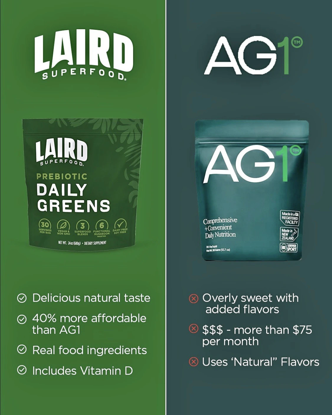
So several ways we might want to increase perceived contrast here, specifically by combining Contrast Principle with complimentary principles:
- Contrast Principle + Loss Aversion: Tap into negative experiences, triggering loss aversion in doing so, and making the solution more appealing in contrast.
- Contrast Principle + Selective Attention Effect: Focus more so on specific elements on the ad, so to increase perceived contrast. For example, draw more attention to the ticks and crosses to better communicate perceived benefits and drawbacks.
- Contrast Principle + Peak-End Rule: Change the focus of the ad so that ends with positive outcomes, leaving a stronger positive impression. This might involve changing the point of comparison from another brand to a simple before and after.
- Contrast Principle + Color Psychology: Use color cues to focus on one comparable element more so than the other. The absolute worst thing that can happen with this type of ad is if the viewer is confused as to which option is better. So make it super-easy for them to understand, not only on a conscious level, but also deeper.
Ok, so let’s take one of these recommendations forward into the re-design studio.
Hover over the slider below to see the before and after.
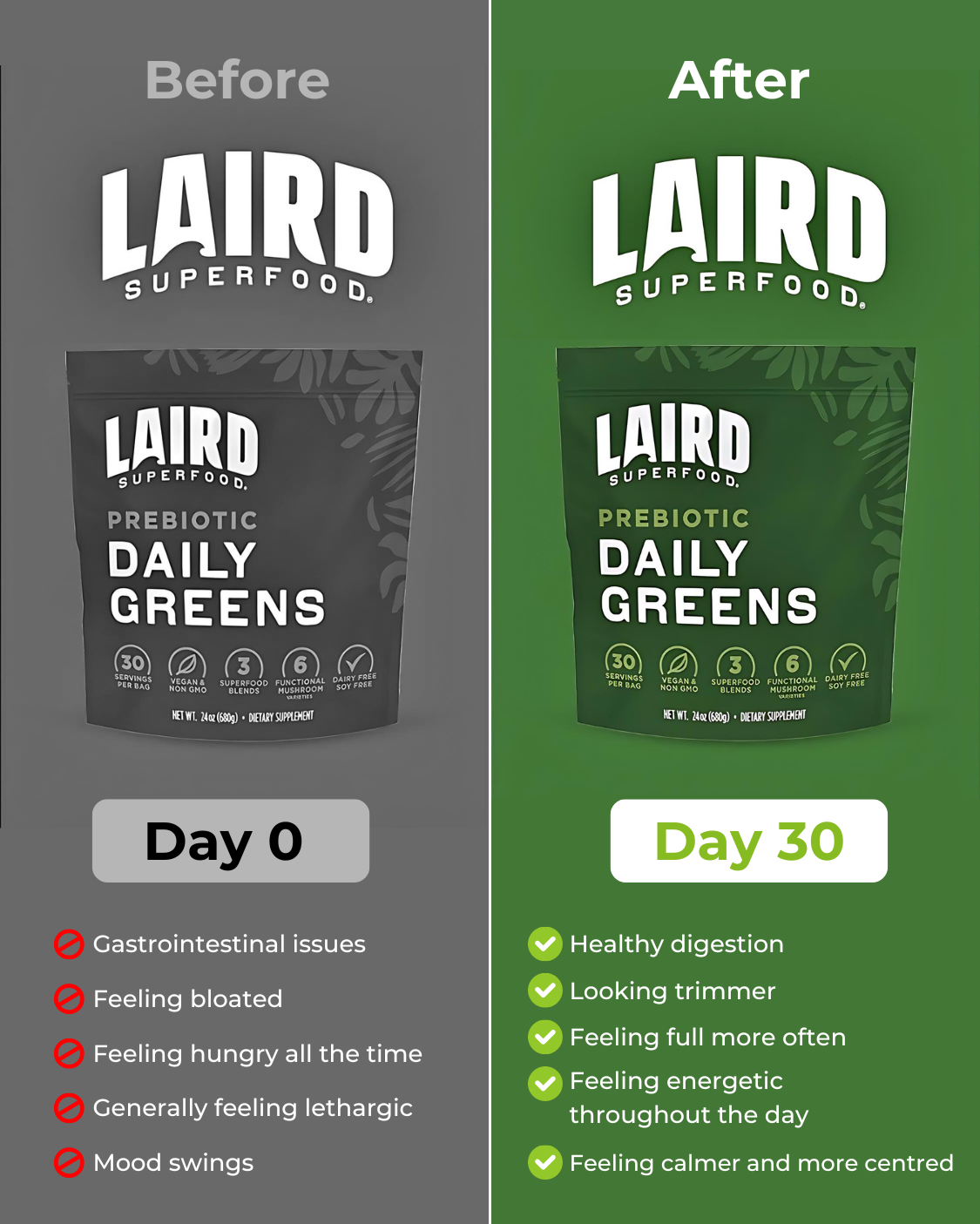
Which do you prefer?
The revised ad changes the context altogether, from “Us vs. Them”, to “Before vs. After”. In doing so, it uses color and symbols to paint a picture of common symptoms. Using cues for “Day 0” and “Day 30”, helps to focus the attention (Selective Attention Principle), on a timescale to realize the purported benefits of the product.
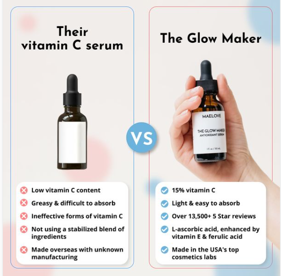
Here are a couple more examples of the Contrast Principle in action, and some ways we might want to use certain cues to increase the perception of contrast:
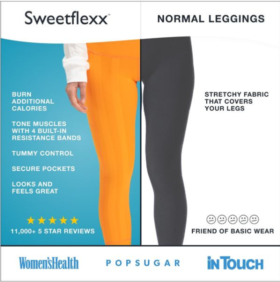
Left: Use icons to make the differences more immediately apparent (Cognitive Fluency). Use active phrasing on the left hand text, such as “Burn Additional calories”, “Tone Muscles”, “Flatten Tummy”, “Protect Belongings With Secure Pockets”. Draw more attention to text elements by highlighting background or underlines behind key points on both sides (Von Restorff Effect).
Right: Increase bottle size of “The Glow Maker” relative to the bottle image on the left. Instead of a blank label, change the competitor bottle to a blurred image on the label to foster intrigue, and make the ad less generic (Curiosity Gap). As we’re not comparing social proof signals (“Ineffective forms of vitamin C” doesn’t really correlate to “Over 13,500+ 5 Star reviews”), move the reviews element out of the comparison table and under “The Glow Maker” heading, to increase visibility of this core USP (Selective Attention).
8 Steps To Execute Beautifully
- Enhance Contrast + Selective Attention Effect: Identify key differentiating elements. If featuring brand comparison, audit competitor products and look for weaknesses in their customer reviews. Once you’ve settled on the structure of the ad, use color or design to draw attention to make their weaknesses glaring.
- Utilize Contrast + Color Psychology: Pick colors that match your message. Use different colors to show options clearly. Make sure the best option stands out.
- Improve Cognitive Fluency: Use icons or pictures to show differences quickly. Use clear, active words to describe benefits.
- Implement Von Restorff Effect: Use colors or underlines to highlight key points. Make important info look different from everything else.
- Create Visual Hierarchy: Make important things bigger, like product images.
- Refine Comparison Elements: Only compare things that are related. Keep other info separate.
- Apply Contrast + Peak-End Rule: Make sure your ad ends with something positive. The last thing people see should be really good.
- Final Review: Make sure it’s clear which option is best. Everything should help show the differences. Keep the ad clean and not too busy.
Potential Pitfalls
- Over-Contrast Leading to Visual Clutter: Too many contrasting elements can make ads and landing pages look messy. Keep designs clean and easy to follow.
- Inconsistent Brand Image: While contrast is powerful, it should align with your overall brand aesthetic. Avoid contrast that feels out of place or damages brand consistency.
- Competitor Spotlight: If you’re spotlighting benefits vs. competitors, you’re effectively paying for their brand exposure – so be sure that the overall message is water-tight, leaving no room for interpretation or potential confusion.
- Misleading Contrasts: Be cautious of creating contrasts that could be perceived as deceptive, particularly in pricing or feature comparisons.
- Overreliance on a Single Contrast Method: Diversify your approach to contrast. Relying too heavily on one method can lead to diminishing returns.