Definition
Selective Attention is a cognitive process where people are drawn to focus on specific stimuli or aspects of an ad or landing page, while ignoring others.
Essentially, it’s about strategically directing users’ focus to the most important elements.
At its core, Selective Attention works by manipulating visual hierarchy and cognitive load. You’ll see it applied in:
- Call-to-action button design: Using contrasting colors or sizes
- Product highlighting: Emphasizing featured or sale items
- Ad structure: Strategically positioning elements within an ad for maximum visibility
- Content structure: Using headings, bullet points, and white space to guide reading
Key Points
- Focus facilitator: Helps us concentrate on what’s deemed important
- Distraction filter: Blocks out irrelevant stimuli to prevent overwhelm
- Efficiency booster: Allows for quicker processing of relevant information
- Conversion sculptor: When directed properly, can guide users towards desired actions
Why It Works
Selective Attention taps into several psychological mechanisms:
- Habituation: Repeated exposure to stimuli can lead to decreased attention over time
- Cognitive Load Theory: People have limited cognitive resources, so they selectively attend to information
- Visual Saliency: Certain visual properties (color, size, motion) naturally draw attention
- Gestalt Principles: The brain tends to group similar elements and perceive patterns
- Information Hierarchy: People prioritize processing of information based on perceived importance
- Change Blindness: Individuals often fail to notice changes outside their focus of attention
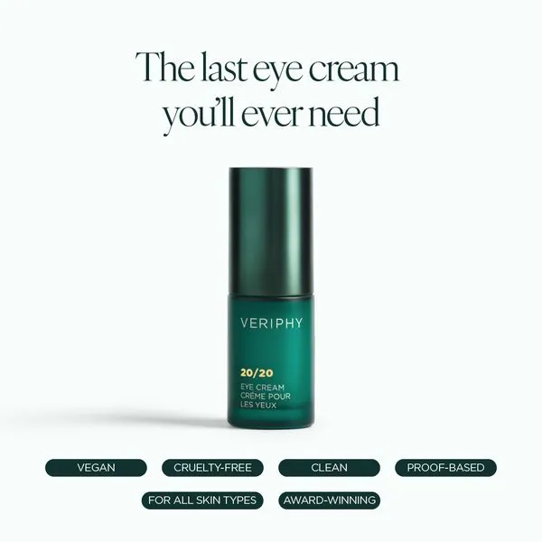
Real-World Example
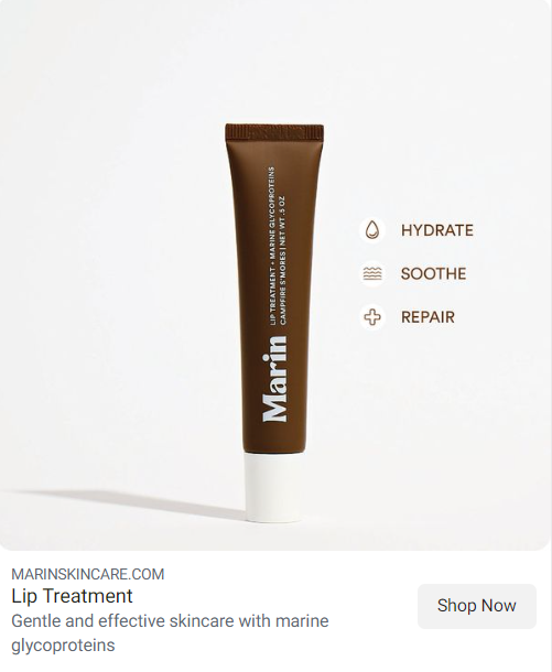
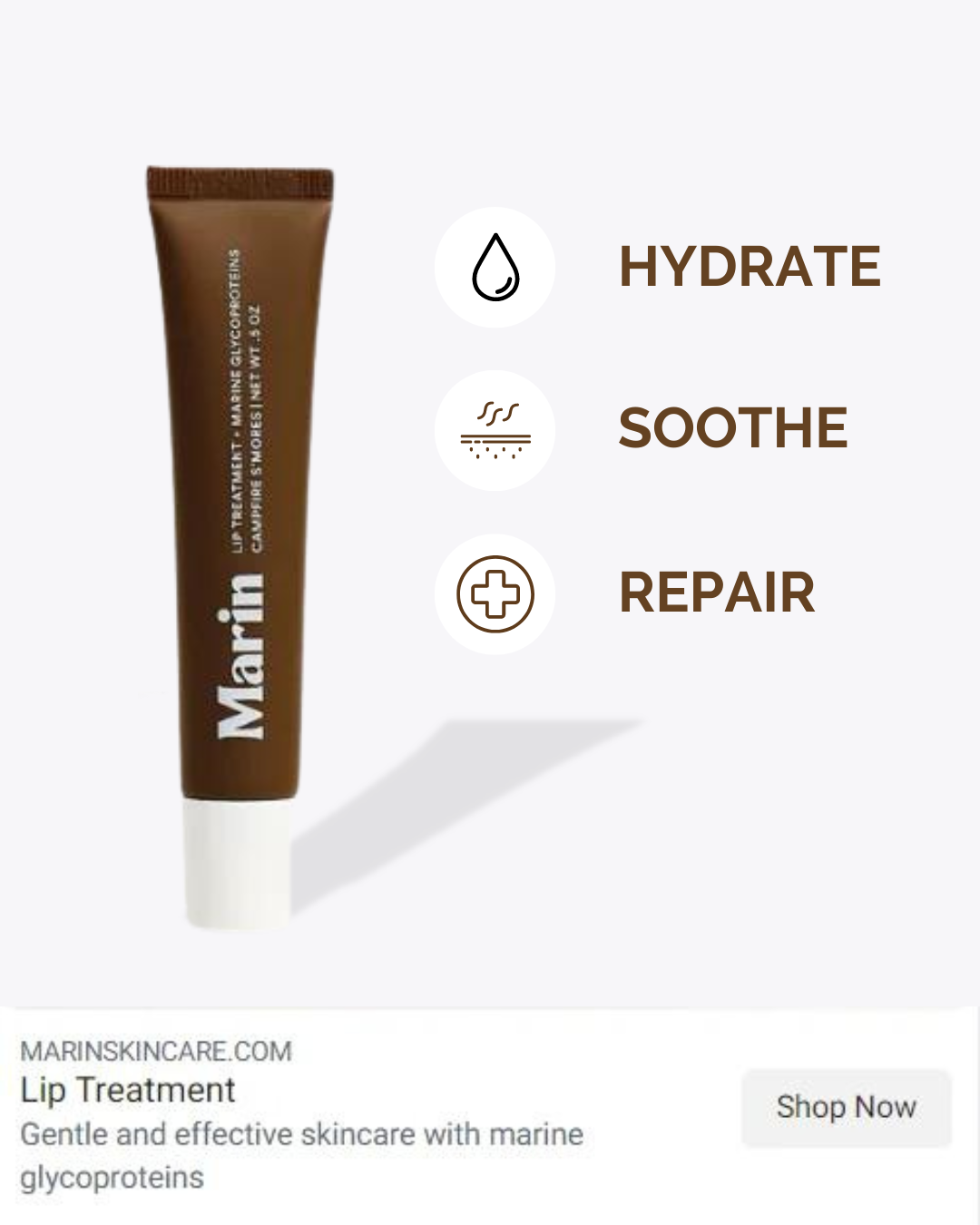
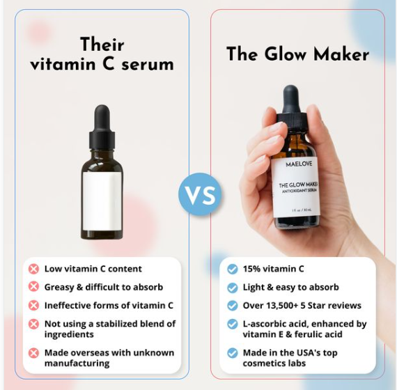
Let’s take a look at this ad from skincare brand VERIPHY. On the face of it, it’s a pretty solid ad with a clear focus on Selective Attention – a headline, a product image, and several scattered text cues at the bottom.
But where to look first? Well let’s analyze the ad in thirds – headline (top third), image (middle third), text cues (bottom third). Given the contrast against the light background, we’re naturally drawn to where the colour contrast is the ‘heaviest’ – the middle third (product image). And although the bottom third is heavy on contrast, the text is too small to make any difference.
So how can we improve the on the ad with Selective Attention in mind? Let’s start by introducing the following principles:
- Visual Hierarchy Enhancement:
- Loss Aversion + Color Psychology + Contrast Principle: Add in colour cues to focus in on the core benefit. Use gradual changes in color to communicate a benefit-driven narrative.
- Loss Aversion + Von Restorff Effect: Amply certain elements visually by providing more background weight.
- Loss Aversion + Selective Attention Effect: Use directional cues to direct attention to specific parts of the ad, so to improve information processing.
- Loss Aversion + Scarcity Principle: Introduce a scarcity element into the ad.
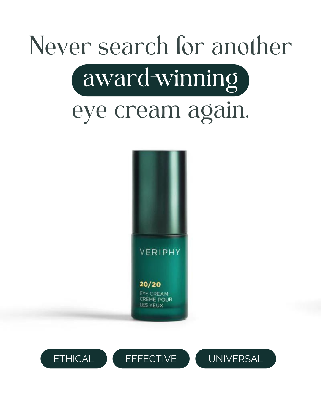
Ok, so let’s take all of these recommendations forward into the re-design studio.
Hover over the slider below to see the before and after.

Amplify Loss Aversion by using copy to reduce perception of risk – The “OR IT’S FREE” text taps into the fear of missing out on a risk-free opportunity.
Loss Aversion + Color Psychology + Contrast Principle: Add in colour cues to focus in on the core benefit. Use gradual changes in color to communicate a benefit-driven narrative.
Loss Aversion + Von Restorff Effect: Amply certain elements visually by providing more background weight.
Loss Aversion + Selective Attention Effect: Use directional cues to direct attention to specific parts of the ad, so to improve information processing.
Loss Aversion + Scarcity Principle: Introduce a scarcity element into the ad.

Which do you prefer?
Check out these other examples of the Authority Principle in action – with some ways that we’d crank up the Authority to 100:
Left: Authority + Contrast Principle: Make the “AS SEEN IN: VOGUE GQ VANITY FAIR” stand out more by using a contrasting color or larger font against the background. Add in some Cognitive Fluency by simplifying the main claim to something like “Expert-Approved: 20x More Effective Than Retinol, Zero Irritation.” for easier processing. If they really want to go for over-kill, add in the Peak-End Rule by ending the the ad with a strong authoritative statement, like “Trusted by leading beauty experts”.
Middle: Authority + Selective Attention Effect: Use a unique visual element (like a seal or stamp) for the “CLINICALLY PROVEN” claim to draw more attention, in contrasting color. Increase Cognitive Fluency by going with two stats instead of three, with larger font – stats #1 and #3 are similar enough. Add in the Contrast Principle by adding background shading behind key benefits within the stats, such as “visible reduction”, and “increase in moisture”.
Right: Authority + Von Restorff Effect: Make the Allure Best of Beauty award stand out more by increasing its size – and are the 5 stars really necessary? Add in the Contrast Principle by using a contrasting color scheme for Allure quote to make it pop a
Steps To Implement
- Identify key elements: Determine the most crucial parts of your message
- Create contrast: Make important elements visually distinct from their surroundings
- Use pattern interrupts: Break expected patterns to grab attention
- Use motion: Subtle animations can draw the eye (but don’t go overboard!)
- Employ directional cues: Use lines, arrows, or gazes to guide attention
- Reduce clutter: Remove unnecessary elements that compete for attention
- Test and refine: Use eye-tracking or heat maps to see where attention actually goes
Potential Pitfalls
- Overwhelm: Too many attention-grabbing elements can backfire
- Misdirection: Ensure you’re drawing attention to truly important elements
- Neglecting content: Don’t let style overshadow substance
- Accessibility issues: Ensure your attention-grabbing tactics work for all users
- Banner blindness: Users may ignore elements that look too much like ads