Conventional marketing wisdom says to meet your audience where they are.
If this is the case, then marketers should all be flocking to Facebook to sell our products, right? Well, there may be over a billion users on Facebook, but there are also over 6 million advertisers. Standing out in such as a sea of competition is by no means easy, and the importance of ad creative cannot be understated.
In this post, we’ll share some inspiring examples of retail Facebook ad examples, why they’ve done so well, and how you can replicate their success. Let’s take a look.
Sign up to our free Google Ads email course.
7 days, 7 lessons. Everything from how to structure your Google Smart Shopping campaigns to ad testing, and YouTube ads excellence. Sign up and level up your Google Ads eCommerce game.
1. Allbirds
When it comes to Facebook advertising, it’s hard for smaller brands to compete against the heavy-hitters with deep pockets.
Allbirds, however, have cleverly differentiated themselves within their creative. Their mission is to “create better things in a better way” with a focus on making shoes which are light, comfortable and made from sustainable resources.
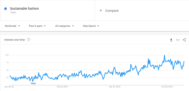
They’ve found a loyal audience and are committed to a growing cause in sustainable fashion. This subset of the fashion industry has seen a steady year-on-year growth which shows no signs of dropping off, with Google trends showing a steady increase in search volume over the past five years for terms centred around the topic.
The way Allbirds has chosen to communicate with their audience in this niche make their Facebook ads a breath of fresh air. They’re balanced, educational and, somewhat understated, tying in beautifully with the brand’s overarching ethos of quiet, simple sustainability.
Why they're winning
2019 saw an estimated online spend of around £106 billion in the UK retail sector. That’s a lot of money, and ultimately, it’s getting harder to compete for a share of that action. So how did Allbirds stand out from the pack?
Product imagery
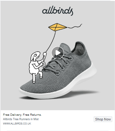
With the newsfeed as cluttered as it is, online retailers who want to master Facebook ads need to make sure that they’re making an impact, visually. One essential way to do this is with a product close up, which is one area where Allbirds stand out versus other direct-to-consumer brands.
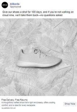
Their Facebook ads are image-rich yet incredibly simple, most of them with just a high-resolution image of a shoe in the centre of the frame. The noticeable lack of distracting noise to the creatives makes for a clean, fresh, and focused message.
Product imagery: Replicate their success
How can you replicate their success? With surprising ease.
- Ensure that your creatives are uncluttered and the product that you’re selling is clear.
- Be certain only to use images that are of excellent quality and resolution. According to Shopify, the perceived value of your products is directly impacted by the quality of your product photography.
- Take pictures of all angles. Zoom into the detail. Accentuate texture and detail at close-up levels so your visitor can get a sense for how a product will feel on their body or in their hands.
Headlines and descriptions
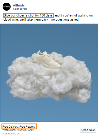
The best headlines are those that minimise friction to purchase, and Allbirds do this in almost every ad offering free delivery and free returns, as well as a free 100-day trial.
Headlines and descriptions: Replicate their success
How can you put these great ideas into practice?
- Identify your USP and make sure that it appears clearly on all your ads, no matter their placement. According to Instapage, including this in the ad headline immediately lets prospects know what’s different and special about your product or service, compared to competitors. This leaves them feeling like they don’t have a choice – they have to click your ad.
- Always aim to use headlines which will stop people mid-scroll.
Gentle creatives
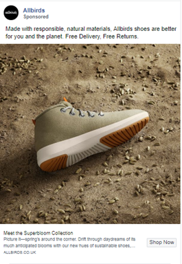
Gentle creatives: Replicate their success
What can you do to reap the same benefits?
- Facebook itself evangelises visual consistency: “If you’re running multiple ad sets within a single campaign, make sure that all of your images have a consistent theme and tie together visually. People will recognise your ad more easily and stop to see what else you have to say”.
- Understanding exactly who you’re targeting will help you to set the tone for the colouring, image selection and content of your ads. Show them visually that you know they’ll respond to.
- The one-size-fits-all approach simply won’t work on Facebook, so ensure that your visuals tie in with your audience targeting. Remember that you’re looking to engage with individuals, so a generic message with stock visuals is easy to ignore. Fit your visuals to your demographic, to their context, and to their interests.
2. Harry's
The Harrys brand rests easily on a straightforward and honest approach; easy to digest, gently educational, and with a touch of humour thrown in for good measure.
In their field of men’s grooming products, they have a licence to delve into creative macho-mode, yet they don’t. They’ve kept it simple.
Why they're winning
Competitor comparison
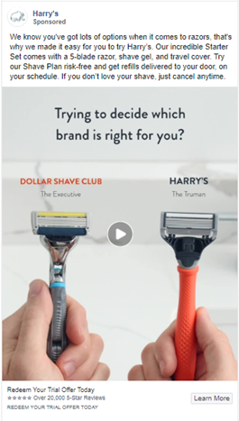
Competitor comparison: Replicate their success
A competitor comparison can work as an excellent sales tool – provided you compare favourably. Our Mastering Facebook Ads study found that 57% of high-growth retail startups used competitor comparisons within their Facebook ad portfolio.
- Make sure that you have all the facts about your chosen competitor before you call them out. Facebook is a public space and one in which you don’t want to be embarrassed. Research their products, read reviews, do your homework.
- Competing brands may be siphoning off some of your customers, but they’re not bad people. Don’t get ugly and petty, it will just make you look bad! Comparisons should be useful, practical, and unemotional.
- Understand what your audience wants and needs before diving in. You may be focusing on price but your audience values availability. Again, do your homework.
Arouse curiosity
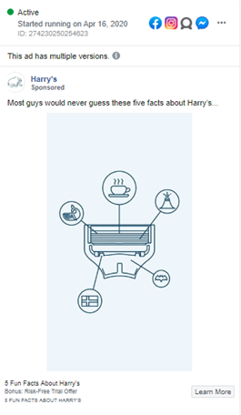
Arouse curiosity: Replicate their success
How can you arouse the curiosity of your audience?
An important point to note before getting in to this topic: clickbait is bad. To entice users to click on your ad and then spam them with ads without answering the question that you posed is bad form. Don’t do it.
- Create a curiosity gap, whereby you tease your reader with a hint of what’s to come, without giving all the answers away.
- Leverage question-based headlines that are likely to capture the interest of your readers.
- Create compelling and useful content which addresses the questions posed in the original headline.
Factual copy
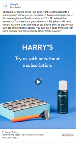
Factual copy: Replicate their success
Marketing to cynical audiences usually means sticking to the facts with highly-functional, straight-to-the-point copy. Therefore, understanding your audience is important to how you communicate with them within your ads.
- Use numbers in your headlines for maximum impact. Our Mastering Facebook Ads study found that 76% of retail advertisers us this tactic within their Facebook ads.
- Don’t overload your audience. Break down your text by using bite-sized bullets to aid readability and recall.
- For functional products, such as razors, get straight down to the nuts and bolts or you’ll quickly lose your audience’s attention.
3. Casper
When it comes to the best Facebook ads, setting the scene for your audience is important. Casper has mastered the art of setting the mood and even refer to themselves as “The Sleep Company”, within their creative.
Far from being a snooze-fest, their ads are highly visual and somewhat abstract, using their products only sparingly to reinforce the core message.
Why they're winning
Casper, one of the most well known direct-to-consumer brands, make their online presence look effortless. Let’s break down what they’ve been doing right.
Sleep quiz
Here’s some smart Facebook marketing! Casper has used gamification in the form of a quiz to prompt their audience to think about getting a new mattress.
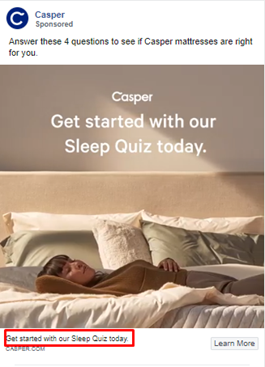
This is genius on so many levels.
- They’ve called it a Sleep Quiz which makes no immediate reference to buying a new mattress. This makes it fun instead of overly ‘salesy’, and is the perfect ad for top-of-the-funnel audiences who may never have heard of the brand before.
- They state up-front that the quiz consists of only four questions, thereby minimising friction.
- They position themselves as the logical solution in their ad copy.
- The leads and information gathered from these ads allow Casper to remarket to an engaged audience.
Sleep quiz: Replicate their success
What can you take away from this simple yet effective tactic for your own Facebook ad campaigns?
- Don’t be afraid to put money behind amplifying quizzes and other forms of interactive ads. According to Social Media Examiner, this type of posts has an inherent viral quality, and is more likely to be shared by people than other forms of content.
- Make sure that your quiz adds value and isn’t simply a poorly disguised sales tool.
- As with any ad, ensure that your ad headlines, creative, and call to action all carry consistent messaging.
Social proof
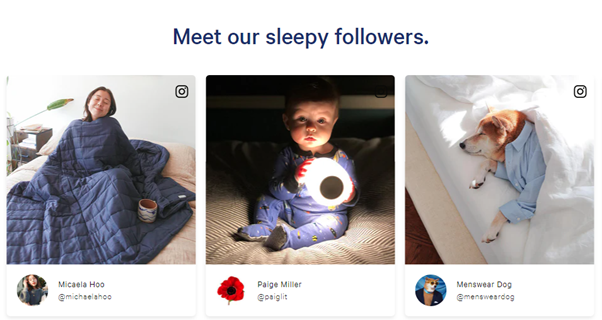
Now, take a look at this Facebook ad.
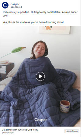
Look familiar? The theme of authenticity runs through their digital channels, with heavy usage of non-stock images and real people in real surroundings.
Social proof: Replicate their success
There is no shortcut to gaining your customer’s approval in the form of social proof. It’s a long road but one that will pay dividends over time.
- Ensure that the option to review your product is turned on within your Facebook page.
- Be sure to ask for reviews. Most people are happy to give a review if they enjoyed your product, so asking and making it easy for them is key.
- Get involved with your audience. Facebook gives you many opportunities to engage with real people, so be sure to answer all your messages, respond to queries and suggestions and reach out with useful and practical information where possible.
Careful colour in creatives
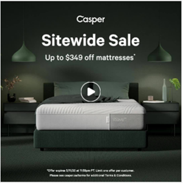
Casper really do excel in the art of subtlety. Not only do they use video extensively, highlighting the quality and softness of their products, but they manage to set the mood in many of their ads with the clever use of colour.
At no point do they say, “We sell great mattresses”.
Rather, dim lighting accompanied by soft, muted tones in their creatives are easy on the eyes and go hand-in-hand with their mission of helping you sleep better.
Careful colour in creatives: Replicate their success
Be cognizant of colour in your creatives.
- According to Small Business Chron, consumers notice colour before words and people within ad creative.
- Think about what mood you’d like to convey and research which colours or tones would best reflect that.
4. ThirdLove
One of the great things about ThirdLove is that they are unapologetically non-conformist, which is unusual in the women’s underwear space. Let’s see how they are knocking it out of the park on Facebook.
Why they're winning
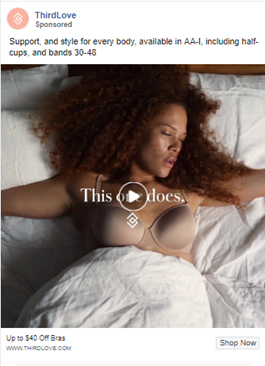
ThirdLove doesn’t try to be something that they’re not, and this authenticity comes through in every image.
Organic-looking creatives
Organic-looking creatives: Replicate their success
Can you tweak your Facebook ad campaign to mimic ThirdLove’s success?
- Use real people – fans and followers are an excellent go-to – to talk about or display your products. We don’t need to tell you that authenticity is lacking in modern marketing, so this approach takes you into a slightly different space.
- Make sure that the content you are using in your ad is useful, adds value, and isn’t overtly focused on pushing the hard sell.
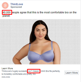
Use numbers in ad headlines
Use numbers in ad headlines: Replicate their success
This is an easy one which you can implement effortlessly.
- According to Velocity Partners, research has proven that every piece of thought leadership content in the world now has to have a number in the headline or it just won’t get read.
- Put your number at the beginning of your headline. For reasons yet undiscovered by conventional wisdom, our brains love numbers at the beginning of sentences.
Transparent pricing
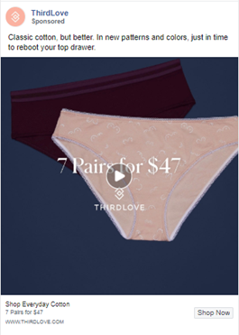
Further to this numbers game, ThirdLove isn’t shy to advertise their pricing. Many online retailers use cryptic messaging and clickbait to get you onto their website. But sometimes all we need is to know if we can afford the product in the first place. This is also a great way of qualifying your audience.
Transparent pricing: Replicate their success
Unless there is some competitor conspiracy that prevents you from advertising your prices, don’t be afraid to use them in your ads. Granted, you may lose people who can’t afford your product, but they wouldn’t have bought from you anyway. On the other hand, you may find an audience that is pleasantly surprised by your perceived affordability and click on your ad.
It’s that simple.
5. HIMS
HIMS present solutions to the problems that nobody likes to talk about. They have successfully managed to address the taboo topics of hair loss and erectile dysfunction in a way that is somehow both quietly subtle and obvious to their target audience.
Marketing a product that people insist that they don’t need is always going to be a challenge. And of course, many women will tell you that tackling these issues directly with a man is the worst idea ever!
Let’s see how HIMS has done this.
Why they're winning
HIMS audience is primarily men under 40. They understand that words will only go so far with this audience, and it needs to hammer home the message in a visual way if it’s to break through taboos.
Fun, eye-catching visuals
Hair loss is no laughing matter. However, HIMS has taken the path of humour and alluded to a problem instead of tackling it head-on – excuse the pun!
They are more than a little irreverent and use imagery that doesn’t directly talk to the pain point in this delicate market.
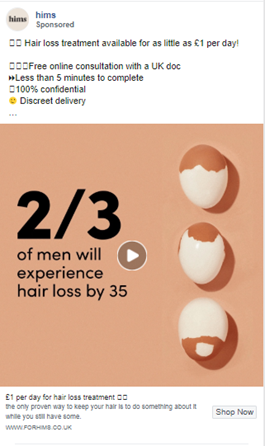
Fun, eye-catching visuals: Replicate their success
Is this Facebook ad tactic something you can use? Tread carefully, but don’t be afraid to be a little off-the-wall with your visuals. Obviously, there is a level of tact and diplomacy that marketers need to adhere to, but breaking convention can work.
Dollar Shave Club shot to fame using off-beat messaging and abstract visuals in their video ad. Did it work? They spent $4,500 to create the video. But they more than made that money back. The video has 24 million views on YouTube. They gained 23,000 followers on Twitter and 76,000 Facebook fans from the campaign. And they attracted 12,000 new customers in 2 days.
It turns out that being funny, weird, and irreverent can pay off.
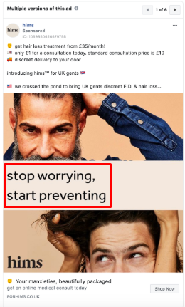
Short value proposition
Short value proposition: Replicate their success
Your value proposition should represent the true benefit of your product, from your target audience’s perspective.
With single image ads in particular, there really is no room for subjectivity when it comes to the tagline. Aim for fewer than 10 words, ideally five or less. The more text you need to use to explain your core benefit, the greater the room for interpretation.
- Visually explaining your USP within your ads can drive more impact than any amount of words. Use creative imagery to give your audience an immediate snapshot of the benefit that your product provides.
Talk like your customer
Further to the previous points around concise messaging and reflecting authenticity, HIMS take this a step further, serving ads with no capitalisation, some iffy grammar and punctuation, and an ingenious choice of imagery.
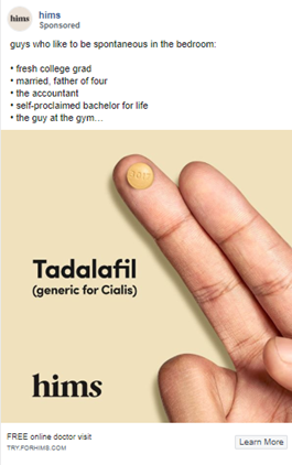
Talk like your customer: Replicate their success
Spend some time on relevant social media platforms or forums and note the language choice that your audience is using.
- Do they make use of local colloquialisms?
- Are there industry buzzwords which they will recognise and connect with?
- Do your visuals reflect this understanding?
6. Outdoor Voices
Why they're winning
Outdoor Voices live their values within their ads, and their audience loves it. Competition is stiff in the sportswear space, but Outdoor Voices still manage to stand out with their remarkable consistency, keeping their mission front-and-centre, and ads jargon-free.
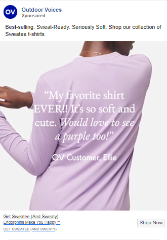
User generated content
Facebook audiences know an ad when they see one, so having your customers create content for you is the perfect antidote to manufactured, airbrushed marketing.
From their website to their social channels, Outdoor Voices actively encourage their customers to tell them what they’re doing right, providing them the platform to refer their friends and people just like them.
The value of user-generated content cannot be overstated. Research from YotPo suggests that 77% of consumers admit that authentic customer photos have a bigger impact on their purchasing decisions than polished images created by marketing departments.
User generated content: Replicate their success
The heightened engagement and affordability of user generated content makes it an incredibly powerful tool for brands seeking to achieve cut-through with increasingly cynical audiences. By handpicking the most relevant customer-created content, advertisers can drive their creative strategy through what their audience actively wants to see. Get this right, and your customers effectively become your biggest asset.
- Getting your audience to send videos or images can be tricky, although less so in the age of the connected consumer. Try running a competition or host an event which will encourage people to engage on the level you need.
- Take a look online and find people who are already wearing or using your brand and reach out to them. Look for influencers in your niche who make excellent brand ambassadors and encourage others to join in the conversation.
- Ask for images in return for discounts. No, this is not bribery, it’s a value exchange.
Short interviews
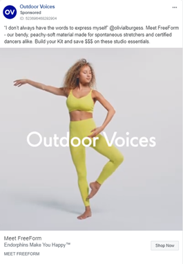
Besides using images, Outdoor Voices have infused a collection of short interview videos into their Facebook advertising: unscripted, genuine conversations with people who are a little shy and who may stammer and blush during a 30-second interview are incredibly endearing, and underline the authentic values of the brand.
Short interviews: Replicate their success
Creating or curating interview videos is not quick or simple. However, they provide evergreen ad content, and they add a large degree of credibility to your brand.
- Depending on your brand, a video created on a smartphone at home may be enough. In which case you can simply follow the same process as you would to elicit product usage images from your happiest customers.
- If you are going for something a few rungs up the production value ladder, then make use of a dedicated videographer. However, getting your customers in the same place at the same time may present an issue.
Use of hashtags
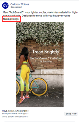
Hashtags are generally used to capture the attention of a reader, to promote an event, product, or brand, or to make it easy for people to follow a conversation. Outdoor Voices have their dedicated hashtag on their website, and it follows them around their various social media: #DoingThings is brilliantly simple and helps to draw out people who are, in fact quite literally, doing things.
Use of hashtags: Replicate their success
Use hashtags and use them right.
- More isn’t always better and shorter hashtags are preferable to longer ones.
- Use hashtags in your competitions and promotions to help people to follow and engage with you online.
- Hashtags can be used more covertly to both shorten and contextualise your message.
- Use hashtags when you don’t have space for captions or explanations.
7. Peloton
Peloton’s mission is to bring fitness home. Essentially, they’re implementing what many companies are only now realising; life is busy, people are stressed, we want to be able to do stuff from home.
Their fitness app, apparel, and connectedness deliver on this promise. Their main offering is a far cry from 1980’s VHS step-classes and instead, has been tailored to be immersive, fun, and accessible to everyone. This much is obvious in their Facebook ad campaigns.
Why they're winning
A brief overview of Peloton’s ads shows that they have listened carefully to what their audience wants and have come up with workable solutions.
Free trial
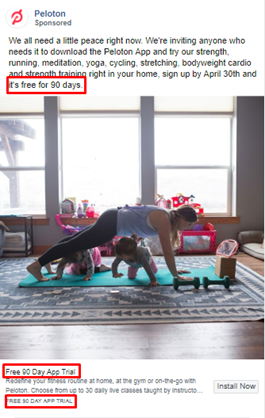
The option to try something for free eliminates a lot of objections right from the get-go, especially for companies with a new or unconventional product.
Offering a 90-day free trial allows potential customers to get into the community and start seeing the benefits of this fitness app, making it that much harder to say no.
Peloton ensures that all their creatives and their entire social message highlight this key point.
Free trial: Replicate their success
Can you use Facebook to offer the benefits of your product or service via a free trial? Here are a couple of things to think about:
- According to 100mba, gyms, yoga studios, and even cooking classes benefit the most from offering a free trial, as these kinds of businesses can only thrive by convincing people to create a habit or modify their lifestyle.
- If you’re operating a business based on recurring revenue or a short buying cycle, then freebies can improve your conversion rates throughout your funnel.
- The psychology of a free trial period is powerful, as it shifts the final decision squarely back onto the shoulders of the customer and makes them feel empowered to make an informed decision, based on their initial experience with your product.
Aspirational imagery
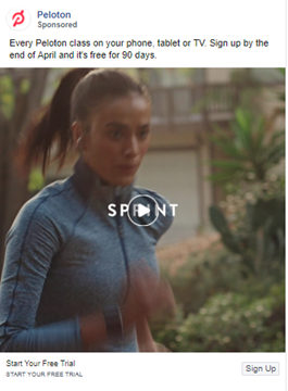
It’s hard not to be inspired by the creatives that Peloton have used. From short video experiences showing intense workouts, to the elation or drive captured in the faces of their models. Yes, we know they’re actors, but still.
Aspirational imagery: Replicate their success
Successful digital marketing relies heavily on understanding human psychology.
- TNP spells this concept out; “our realities are about what we dream and would like it to be rather than what it is. Aspirational brand strategy is concerned with creating the dream and generating positive emotional reactions from consumers”. So, work on ad creatives with passion and positive emotions.
- Peloton has also made a real effort to show potential buyers exactly what they are getting using short but powerfully emotive videos. Two birds, one stone.
Dynamic creative
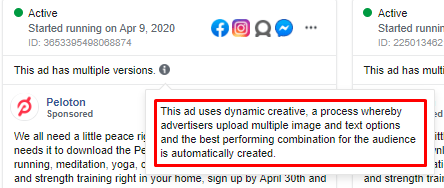
Not only do Peloton have a lot of Facebook ads running at any one time, but they make excellent use of dynamic creatives, which creates multiple versions of the same ad.
Why is this useful? Simply because we can’t always know for certain which image will be preferred by which audience, or which headline will work best in a particular location. By using dynamic creatives, you let the Facebook algorithm do the heavy lifting for you.
Dynamic creative: Replicate their success
Using dynamic ads in Facebook spits out creative based on what’s worked in the past for a particular audience. Try it for yourself.
Hedge your bets and see where it takes you. The fact that you’re not ploughing your entire marketing budget into a single ad gives you a little levity to play with creative concepts and ad copy.
In conclusion
You’ll have noticed a common thread running through our analysis of these incredible brands.
- They know their audience and create content and creatives for maximum engagement.
- They make use of carefully thought out imagery.
- They are authentic and honest in their approach to their ads.
