The compliance-heavy world of finance and insurance can be a challenge to navigate, even for experienced marketers. An intangible product, coupled with stringent regulation around how you can communicate with your audience, means that creativity can sometimes take a back seat during the creative development process.
In this post, we’ll explore some strong finance Facebook ad examples from innovative FinTech brands, and how you can replicate their success.
Sign up to our free Google Ads email course.
7 days, 7 lessons. Everything from how to structure your Google Smart Shopping campaigns to ad testing, and YouTube ads excellence. Sign up and level up your Google Ads eCommerce game.
1. Cleo
Cleo is a straight-talking finance app targeted squarely at millennials, intending to simplify budgeting and raise the financial IQ of its users.
Unlike some of their more established competitors, Cleo’s ads are a breath of fresh air, combining several core elements to blend naturally within the newsfeed, with the end result being finance Facebook ad examples that are right up there with the best of them.
Why they're winning
Cleo’s go-to Facebook ad headline reads: “Feel better about your spending problem.”
Far from being offensive, their entire Facebook ad strategy focuses on being supportive, fun and non-judgemental.
How do they successfully navigate this fine-line, given that talking about money can be a touchy subject, not least with millennials?
User generated content
Spending time on making your creatives relatable can mean the difference between success and indifference on Facebook, given the myriad of content you’re up against. This is where User Generated Content can set you apart.
Cleo’s ads don’t look like ads, which makes them more relatable for an audience that’s being sold-to from all corners. They take the road of making their ads appear like regular social posts, focusing on the interaction between brand and consumer in a clever, unique way.
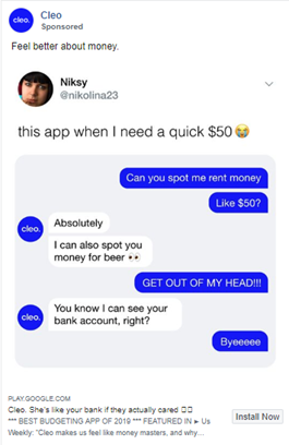
User generated content: Replicate their success
Facebook audiences know an ad when they see one, so having your customers create content for you is the perfect antidote to manufactured, airbrushed marketing.
- Showcase real-life customer interactions which focus on value exchange. This is where your brand’s use of social media can help.
- Remember to visually reflect your target audience in your ads – with their consent of course!
- Respect your audience, and remember to be authentic – consumers are increasingly cynical, and can tell when brands are faking it.
Gamification
Using gamification in a finance app is a smart move as it’s not what we would normally expect from finance brands.
Does this approach work? Gamification is a great way to increase top of funnel visibility, as it encourages people to share your content within their social circles.
There are many different ways you could add a viral touch to your campaigns, and Cleo pulls out all the stops with their finance app offering positive reinforcement, goal-setting and more. This also extends into their Facebook ads, where they focus on the inherent gamification within the product itself.
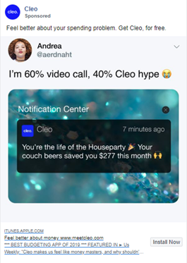
Gamification: Replicate their success
Gamification can be infused into your ads to promote sharing and broader engagement. In doing so, you can expect to drive incremental awareness and buzz around your product, and there’s also the opportunity to retarget ad engagers with more product-led messaging down the line.
- A simple start would be to run a competition. This will increase engagement, and depending on your needs, populate a database or offer insights into your user’s interest points.
- Consider a gamified challenge, a short-term social action with a reward which can take the form of a Facebook ad.
- Don’t forget about your existing users. Consider a loyalty program which operates on a point-based system, with rewards given to the most valuable user actions. Amplify it via your Facebook ads to show prospective customers what they can expect.
Informal tone of voice
Cleo makes novel use of AI in the form of a chatbot, and has built an engaging persona into their conversational agent.
The deliberate choice of using a quirky, slightly cheeky chatbot has allowed Cleo to make finance fun for their users and has taken conversations around money to a new audience.
The personality behind Cleo extends into their Facebook ads creating an informal tone which removes the psychological barrier of ‘finance’.
This communication style is proving incredibly successful with their audience, highlighted by the fact that their quiet entry into the U.S market back in 2018 was met with over 1,000 new members per day.
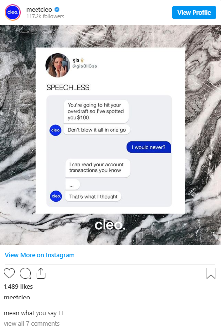
Informal tone of voice: Replicate their success
An informal communication style does not make your business appear unprofessional. Done properly, talking the language of the people is sound marketing sense.
- Informal communication doesn’t always need to be as chatty as the Cleo app, but removing jargon and the dreaded fine print is a great place to start when crafting an ad for Facebook.
- Find the right – lighthearted – tone which can convey a level of emotional intelligence and authenticity in your campaigns.
- Pay attention to the communication style and word choice of your audience, and make use of these exact words and phrases in your ads.
2. Lemonade
Lemonade is a New York-based online insurance company offering low-cost renters’ and homeowners’ insurance. They’re a self-proclaimed technology-first insurance carrier with a product and mission molded entirely around their millennial audience – 75% of them are under 35 and 90% of them are buying insurance for the first time.
Standing out in an industry which has a pretty poor reputation for innovation, is saturated with heavyweight players, and where there are limited ways to differentiate your services is always going to be tough.
In addition, the insurance market is a costly one to dabble in. According to WordStream. The average Facebook cost per click within insurance is $3.77 – double the average across all industries. Even despite these factors, Lemonade is breaking new ground, both in terms of creativity and targeting.
Why they're winning
Their primary audience are millennials, and particularly millennials that rent. With that being the case, their ads need to be distinctive to stand out, particularly when they’re focused on such a dry subject.
They do just that, by combining a number of core elements.
Use of colour
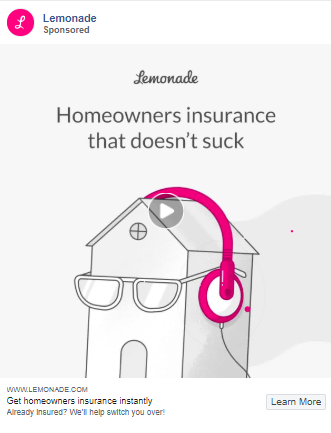
Lemonade knows how to visually layer an ad. The use of whitespace, contrasted with the excellent use of colour, immediately leads the eye to the hot pink details within the ad. Not only does the colour stand out against a monochromatic background, but it also brings attention to the central value proposition. Consistency is also key, and their ads are easily distinguishable by their use of the brand colour, often the only use of colour with the ad itself.
Use of colour: Replicate their success
Using colour intelligently and sparingly can be a great way to draw attention to specific parts of your ad, so don’t be afraid to experiment.
- If you want to stand out, be brave about your use of colour. Perhaps a less-is-more approach will help to drive attention to where you want to focus it. Lemonade does this fantastically, by using colour only on their call-to-actions, which is a sure-fire way to drive clicks and engagement.
- If you have prominent brand colours, be consistent with their use across your ad portfolio.
- Different audiences are likely to respond differently to specific colours. Don’t be afraid to mix it up and use varying palettes for each customer segment.
Animated visuals
Lemonade knows exactly who their audience is and how to speak their language. This is especially true of their visuals; a skateboarding house with pink earphones and sunglasses dancing to the caption of “Homeowners insurance that doesn’t suck” sums that point up succinctly.
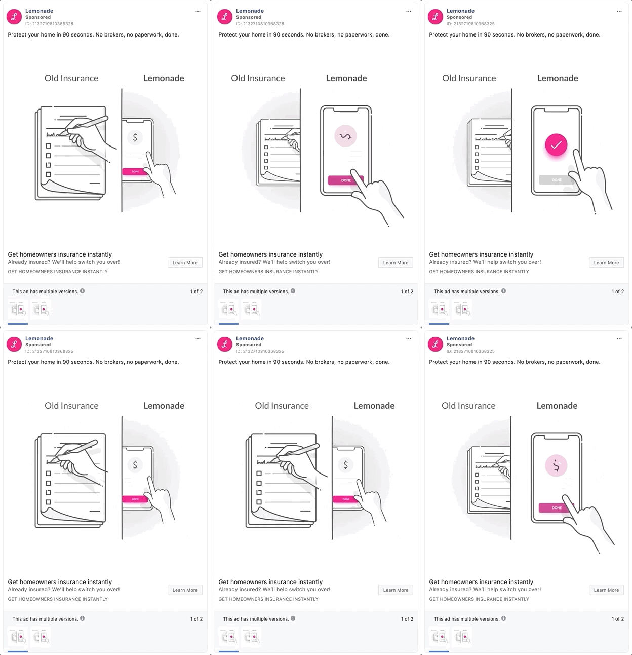
Getting millennials to engage with insurance is a tough ask. But Lemonade does just that, appealing to audiences with snappy, animation-rich visuals that underline the key point quickly. They’re not alone either: our Mastering Facebook Ads survey found that 89% of fast-growth finance advertisers used some form of animation within their Facebook Ads portfolio.
Animated visuals: Replicate their success
No matter how complex your value proposition, animation can be a great way to explain it, in relatable terms.
- Use short, snappy animations to drive visual impact and choose your colours wisely, as this can be a great way to bring attention to individual elements within the ad.
- Some companies tend to shy away from animation because of the perceived cost. However, there are many DIY animation options available online, from GIFs to whiteboard stories. Explore all the options.
- Try and keep your initial animation videos under 30 seconds. It’s much better to have several videos that you can use within an overarching sequence, than one long-form video that will be difficult to repurpose.
3. Klarna
The theory behind Klarna is rooted firmly in the psychology of instant gratification. They satisfy the ‘I want it all and I want it now’ mentality with an app which allows users to shop now and pay later.
Why they're winning
Klarna is unapologetically extravagant and uses Fear of Missing Out (FOMO) extensively alongside a host of bright, aspirational imagery to target a young, vibey audience.
Let’s unpack their Facebook ads.
Themed carousels
Carousel ads are one of the best ways to showcase multiple products on Facebook. Compared to single-image ads, Carousel Ads drive 20-30% lower cost per click. Themed carousels are ads with a shared theme, often with each carousel image in sequential order.
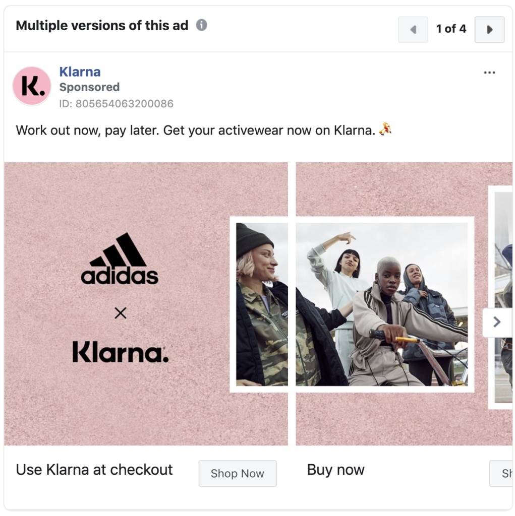
Klarna makes excellent use of a striking five-image themed carousel ad which seamlessly guides users through a selection of products. Using the same background image and overlaying a product allows the user to visually link these products and helps to form a narrative. The core value proposition of buy now pay later is reflected within the individual carousel descriptions.
Simple, yes. But nicely done.
Themed carousels: Replicate their success
A themed carousel ad is a great way of communicating a broad narrative within a single ad unit. Not only does this provide multiple opportunities to show relevance, but it also allows for greater scope for creativity which can result in improved CTR.
- Once you’ve selected a product or service to focus on, decide how to tie it all together. This can be using colour, image style, parts of a given product or visual setting, or for something a bit more abstract, a process, evolution or linear development.
- Make full use of the individual calls to action on each creative, testing various CTAs in a single ad set.
- Use simple, compelling headlines on each card.
The Big 3
An effective Facebook ad is created based on The Big 3: a hook or attention grabber, a value add, a call to action.
Klarna ads use this formula to great effect.
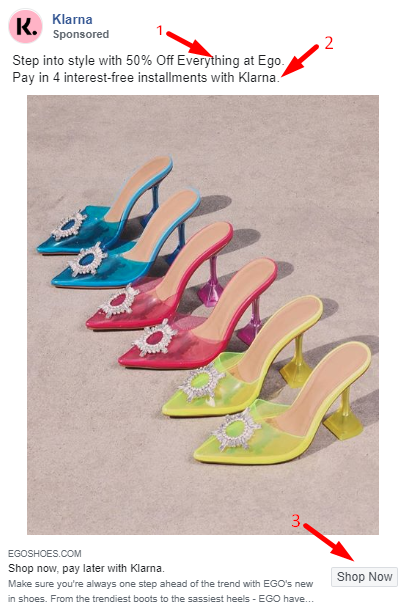
- An aspirational image combined with an attention-grabbing headline of ‘50% off’ is enough to stop any self-respecting bargain hunter in their tracks.
- 4 interest-free instalments adds undeniable value to the offer.
- The CTA command ‘Shop now’ seals the deal.
The Big 3: Replicate their success
Mastering Facebook ads doesn’t have to be complicated. Applying a simple, but repeatable structure can help keep ads coherent and to the point.
- Create a distinctive headline using numbers, emojis, or questions to grab your user’s attention.
- Add a short, enthusiastic point about the benefit of this offer. Keep it simple, and to the point.
- Tell them unambiguously what to do next.
Multiple image sizes
Advertisers have no idea which device their ads will be viewed on, but they do have control over what image dimensions they use for the various placements within the Facebook ecosystem, such as within Messenger, marketplace, stories etc.
Klarna, for example, uses multiple images sizes to ensure the best visual on each placement.
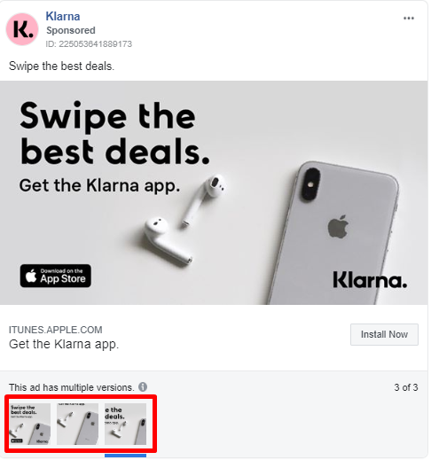
Multiple image sizes: Replicate their success
Ensuring the correct image dimensions is not complicated. Facebook offers a crop and size tool within their platform when creating ads which eliminates the guesswork. There are also a number of online resources available to assist you in choosing the best option at the design stage.
4. Acorns
The Acorns app offers smart and simple saving and investment opportunities. They make excellent use of technology to both benefit and educate their users yet maintain an incredibly simple message throughout their creative.
Why they're winning
The use of an acorn as their logo offers a clever mind prompt which speaks subliminally to growth and maturity. They’ve taken this imagery and thought process into their ads, again targeting a predominately millennial audience.
Topical creative
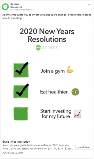
Acorns demonstrate an awareness of their audience’s interests and have made an effort to reach them in that space. Infusing finance into everyday conversations and themes can be tricky, but Acorn do this better than most within their space.
An example of this in action is below, skilfully incorporating the benefits of using their app around the theme of New Year’s resolutions.
Topical creative: Replicate their success
Sophisticated Facebook advertisers remain in-tune to current events which are of interest to their audience, and align their creatives to the most relevant topics.
- Creating a calendar of events, holidays, or functions which would interest your audience is an excellent start. Choose those which are appropriate to your product or service and use this as a basis for an emotive ad campaign.
- Be aware of the conversations already happening on Facebook and tap into them with helpful or engaging commentary.
- Even elements from trending television shows with a large following can be used as a springboard for a topical Facebook ad.
Qualify your traffic
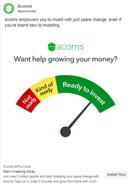
Savvy marketers understand the value of qualifying a prospect before getting them to click through to your landing page. According to Brooks Group, the top five criteria for qualifying your audience includes awareness of need, ability to buy or commit, a sense of urgency, trust in your offering or organisation, and your audiences’ willingness to listen to your message. Acorns find a way to merge several of these criteria into a single Facebook ad. Their ad copy and imagery check-off all the boxes:
- We all need to save – awareness of need
- A simple install action – ability to commit
- Start investing today – urgency)
- Join over 5 million people – trust
Qualify your traffic: Replicate their success
When advertising on Facebook, your audience selection is a critical starting point. Thereafter, let your creatives do the work for you.
- Create top-of-funnel ads to educate people who may not know that they have a need, or that a solution exists for a common problem.
- Be sure to include social proof or other trust elements in your ad copy.
Include phrases such as, start now or limited offer to increase the sense of urgency and encourage people to take action. - Minimise any lingering friction through your CTA.
Social proof
Minimising friction to take action can also be achieved through incorporating social proof. Within our Mastering Facebook Ads study, this tactic was found to be surprisingly popular amongst fast-growth finance advertisers, with 76% infusing social proof elements within their ads.
Social proof is public social engagement that other users can see. This includes likes, references to the number of customers, and also award wins and reviews. These interactions can matter just as much as the ad copy when it comes to building trust and credibility.
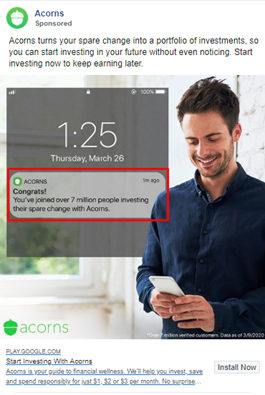
Acorns use social proof extensively to signal both trust and reach saying, ‘You’ve joined over 7 million people investing their spare change with Acorns’.
Cleverly interwoven in this single sentence is how the app works and one of the key benefits. Smart copy to go with a smart image!
Social proof: Replicate their success
Some form of social proof should be applied to all ads, whether it’s a number of how many have bought your product, review ratings, or references to an award win and press snippets.
- Social proof references can be included within the description of the ad, or for best results, overlaid on top of your image for maximum visibility.
- Be mindful that the social proof you’re using should be relevant to your target audience. For example, if you’re aiming to engage with millennials, ensure that any press mentions are relevant to the publications that they’re likely to read.
- Perhaps the strongest form of social proof are testimonials and case studies from happy customers. Mention them within your ads.
5. Plum
Plum makes great use of AI in a finance app which helps you to manage your money better, invest small amounts frequently, and stops you from being overcharged on your bills. Their mission is to: “Set more money aside, invest in things that matter and reduce those pesky bills.”
Again, their audience is predominantly millennials, who are looking for guidance to build their financial IQ.
Why they're winning
Plum’s ads are firmly focused on real people using tech to modify their savings behaviour. Besides developing a great product, they also get the basics right when it comes to their Facebook ads.
Made for sound off
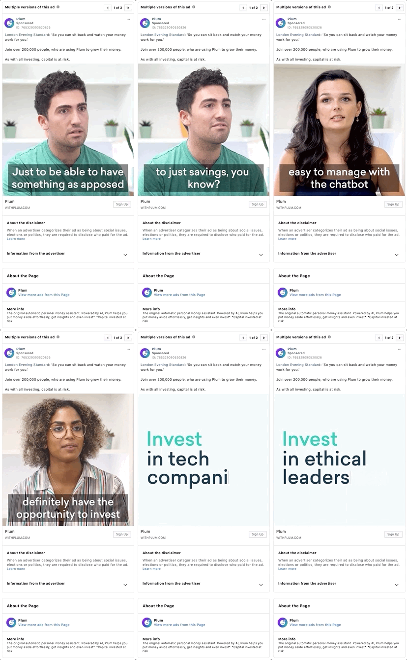
With 96% of Facebook users on mobile, we can assume that users are more likely to be on their device while commuting, second screening, or perhaps for late at night as they unwind.
Either way, there’s a good chance that they will have their sound turned down, which can impact the efficacy of video ads. Plum has overcome this potential problem by adding captions which allow for their ads to be watched and their message ‘heard’ even when the sound is off. This approach is also more likely to stop people mid-scroll, as they can read the ad as they navigate the newsfeed.
Made for sound off: Replicate their success
Subtitles and text overlays aren’t necessary for all ads, but should be used when the communication is predominately verbal, feature people in action, or when you’re trying to explain a scene.
- Use captions when people are speaking or when there is any form of narration.
- Consider using videos which tell a story without the use of sound. These can be highly emotive and allow you to be a little more creative.
Use of emojis
WhatsApp has made emojis ubiquitous. With so much communication taking place via text instead of face-to-face however, key elements of our message can be lost, and emojis can help to fill this gap perfectly.
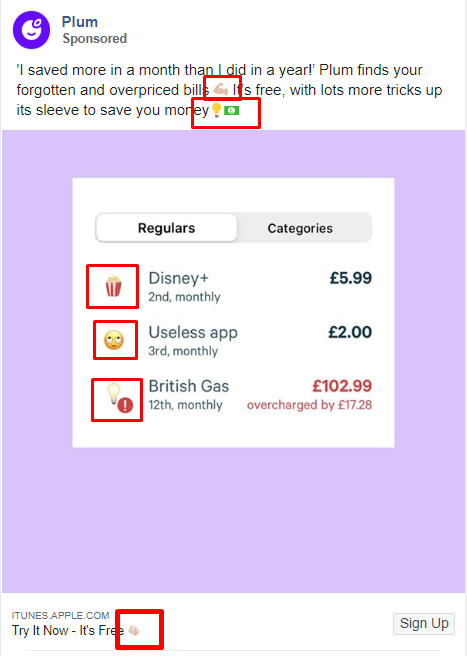
Emojis are friendly and emotive. They can also add a visual element to your communication to make it easier to understand or add weight to your message.
Plum has made excellent use of emojis both in their app and their ads.
Use of emojis: Replicate their success
This one is simple. Don’t be afraid to use emojis in your Facebook ads. Even when you’re creating ads for a B2B audience, you’re still trying to engage with people.
- Use emojis that are likely to be used by your audience, avoiding ambiguity where possible.
- Test ads with emojis, against ads without. Note the results, and take these learnings forward.
- Adding emojis in ads can make them appear more natural and non-promotional. The more organic an ad appears, the more likely that people will engage.
6. Coinbase
Coinbase offers a secure mobile bitcoin wallet which makes buying cryptocurrencies easy, safe, and less intimidating. Although cryptocurrency like Bitcoin has been around since 2009, the concept can be tricky to grasp, which makes it difficult to market to the average man or women on the street.
Why they're winning
Coinbase knows that their first challenge is to make a complex topic, simple and relatable. To this end, they leverage a variety of tactics, and heavily lean on their platform as the main source of visual communication.
Platform walkthroughs
Sometimes, it’s fine to talk about how you add value to the customer in abstract terms. But there’s nothing quite as powerful as actually showing how you add value. Platform walkthroughs are just that: the opportunity to show how to achieve a specific benefit in a matter of seconds.
In pitching a product which may be perceived as novel, foreign, or complicated, savvy marketers know that vagueness is their enemy. Perhaps not surprising given the high proportion of startups analysed, our Mastering Facebook Ads study found that 69% of finance advertisers leveraged platform walkthroughs within their ads.
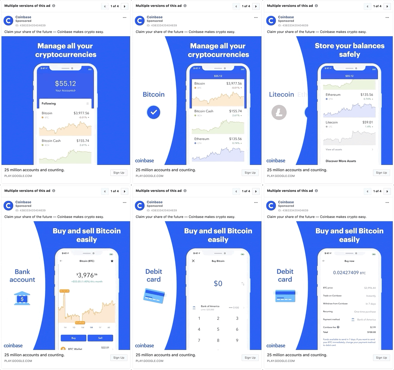
Coinbase knows that a majority of their audience aren’t going to be too savvy about cryptocurrency, which makes a platform walkthrough a wise choice. In doing so, they highlight just how easy their app is to use, with a virtual walkthrough that takes the user through the investing process in a matter of seconds.
Platform walkthroughs: Replicate their success
By showing the value you create through disrupting a currently broken process, you can immediately present yourself as a favourable option to would-be customers. If it takes a matter of seconds for your prospective customer to achieve a specific outcome, show it!
- If using images, show actual screenshots with concise descriptions.
- Move quickly through simpler points, but not too quickly to confuse your user.
- Use copy to annotate each step.
- For best results, use extended GIFs, or better still, video.
Short-form video
One might think that a complex area like cryptocurrency investing requires a longer video to get the message across, but this is not the approach of Coinbase. They have, instead, made use of short-form video such as this one below – lasting all of 7 seconds!
When we think that people buy on emotion, then we can begin to understand why Coinbase chooses to focus on shorter-form content to pique the user’s emotional interest in the first instance, and then later feeds them the nuts and bolts via retargeting to satisfy their logic.

Short-form video: Replicate their success
When playing on emotion, video can be a better tool than static imagery, as there is much more scope to convey desired feelings. The exact recipe will depend on your product but be sure to:
- Get to the point, quickly. Ensure that the first few seconds of your video are compelling enough to get people to watch the rest. 65% of people who watch the first 3 seconds of your video will watch until at least the 10-second mark.
- Make sure that your visuals are uncluttered, cohesive and easy to view on all screen sizes.
- Use text overlays to reinforce your message.
7. Cuvva
Cuvva is a car insurance provider that specialise in temporary car insurance, single trip, and learner insurance with the promise to cut out the jargon, paperwork and call centre queues so often associated with the insurance industry.
Why they're winning
Cuvva has filled a gap in the market that many people weren’t even aware of. The challenge always exists with a new concept in making it easily understood, especially within the saturated mire of car insurance advertising.
Cuvva, however, has scraped away the jargon and gone for a sleek, almost minimalistic approach to drive engagement.
Clean creatives
Images appeal to our senses more than text, are more memorable and can tell a story in a couple of seconds.
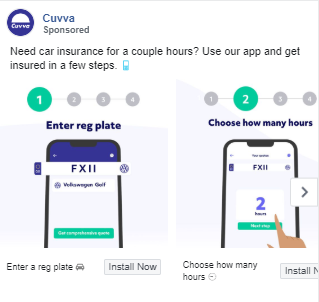
Cuvva has made excellent use of clean carousel ads such as the one below. At a glance, we notice the following factors:
- The headline says exactly what they offer.
- Their CTA is clear.
- They show a counter on the steps mentioned in the headline.
- They show screenshots of what to expect, once on the platform.
- Each carousel card is accompanied with a headline that describes the step in the process.
Clean creatives: Replicate their success
Sometimes we’re too close to our product to convey its simplicity, or we may want to expound the many exciting virtues of our service. Too much information will either confuse or overwhelm our audience though.
- Choose a single facet of your offering which you would like to focus on.
- Brainstorm with your team to note down words, phrases and calls to action, and then distil these down to the most appealing.
- Create visuals which speak to the solution.
- Scrape away any unnecessary words or imagery which doesn’t form part of the framework of your ad.
Animated USP
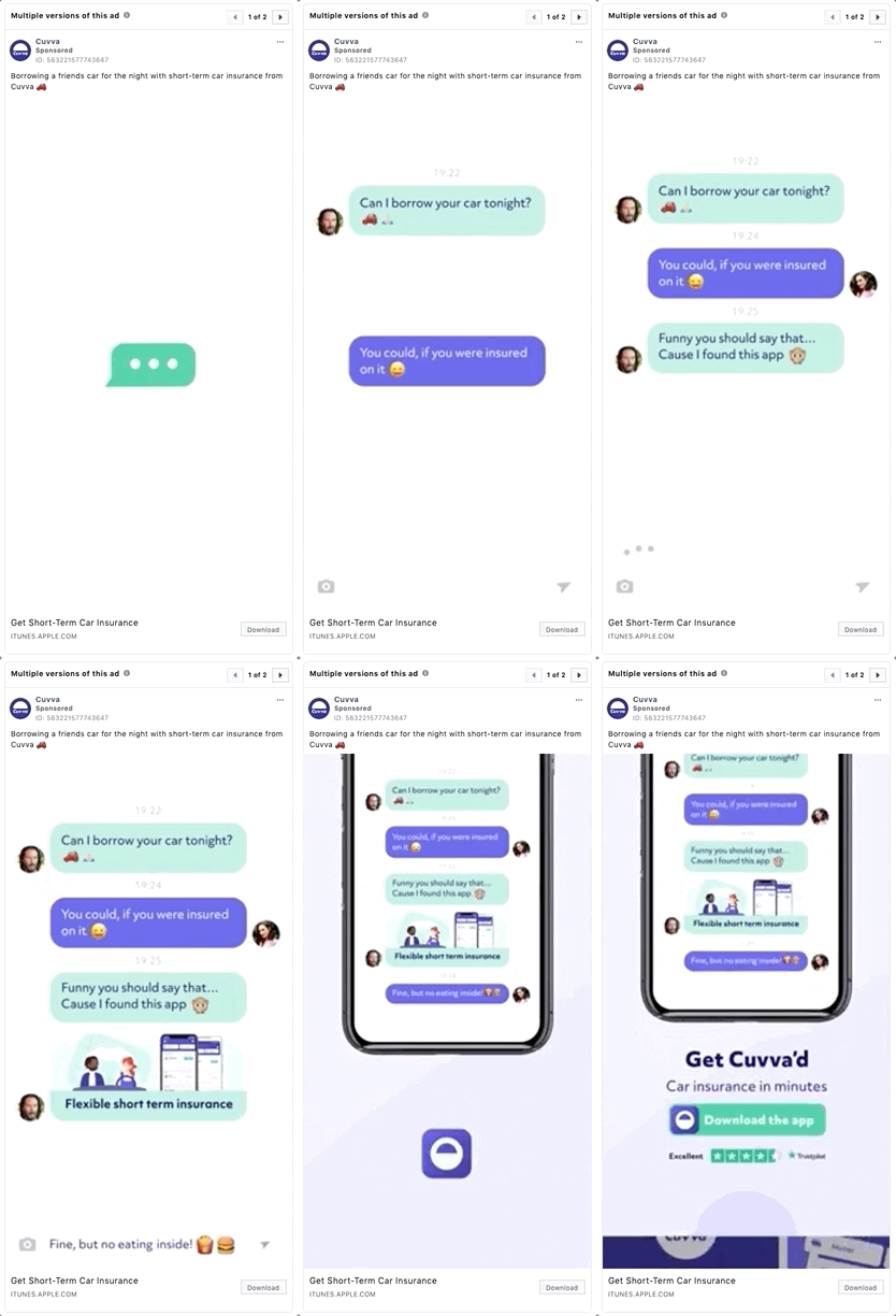
We discussed the virtues of an animated USP earlier, and Cuvva took this to the next-level, combining animation with conversational marketing in the simplest way. Every piece of the ad is elegantly simple, easy to follow, and demonstrates their USP clearly.
Animated USP: Replicate their success
When you consider that video or animation is often cited as the most captivating Facebook medium for engagement, it makes sense to use it to emphasise your value proposition.
- Simplify your USP into its most basic form. Think about the core benefit that you provide.
- Use imagery, colours, and messaging that compliment your message.
- If your product or service is difficult to explain, provide an overview of the process to achieve the desired customer benefit.
In conclusion
The field of finance can be complex, but your ads don’t have to be.
These emerging FinTech brands share a common theme – simplicity, and being transparent about how they drive value. Finance in particular is an industry where the end benefit can be quite abstract, so being innovative with your use of Facebook as an acquisition channel is imperative.
Our Mastering Facebook Ads tool, encapsulates many of these themes to provide a library of proven tactics that can be used to construct best-in-class advertising creative. By highlighting examples across the three key areas of ad relevance, visual quality and offer quality, it offers a growing database of key takeaways which you can put to instant use in your own Facebook ads.
If you lack inspiration, don’t go it alone.
