How to craft masterful Facebook ad experiences
Learn what top advertisers have in common when it comes to their Facebook creative.
Invest in Creative.
Good creative isn’t a choice, it’s a pre-requisite for Facebook success. Advertisers must stand out in unique ways to drive engagement and recall.
To this end, re-purposing website and stock images simply won’t cut it anymore. Your audience deserves more than that. The newsfeed rewards only those that are willing to push the boundaries of creativity, and that starts by investing in the process of creativity.
This involves bringing your designers to the fore, and empowering them to make creative decisions with your end audience in mind.
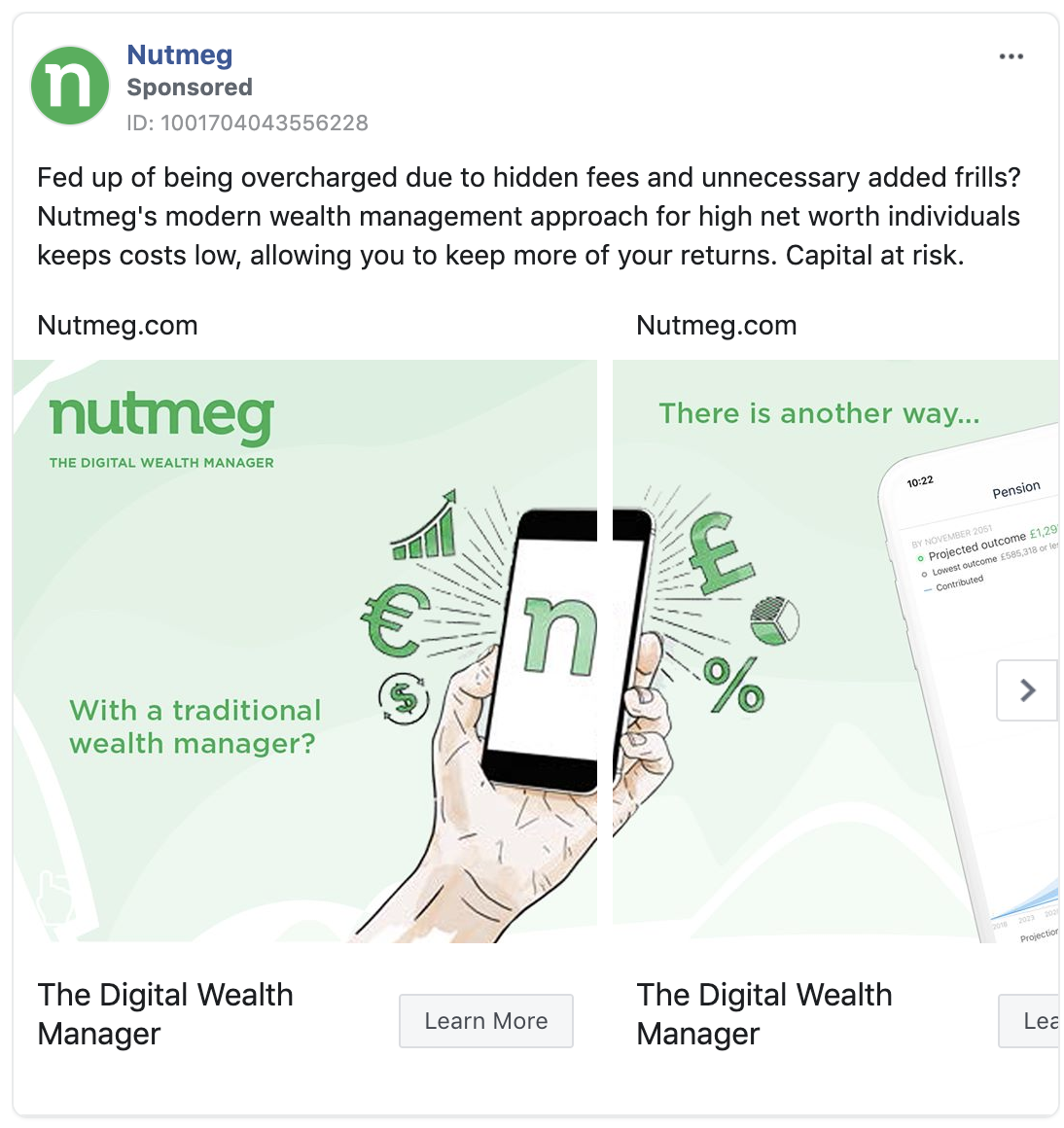
Take this example from Nutmeg. It could have been just another carousel ad, but instead chose to be something different. Rather than expressing several messages across independent cards, it instead chooses to communicate a broad narrative within a single carousel unit, integrating the individual cards so that they appear as one overall ad. With this approach, not only do they succeed in catching the eye, but they also drive home a relevant message in a structured and engaging way.
The symptoms of under-investment in the creative process are many; low CTR, low relevancy scores, and high Cost per Click metrics are some key tell-tale signs. Brands need to find new ways to get their message across, as ultimately your creative marketing decisions will dramatically impact your ad performance.
Unpack your USP.
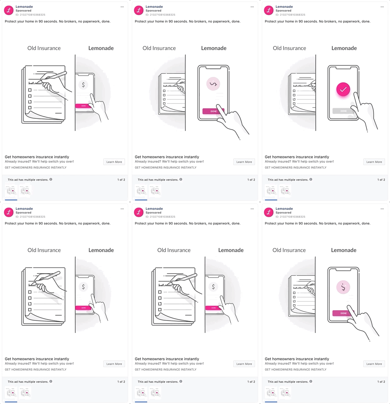
Our study found that a whopping 89% of high-growth finance brands used some form of animation within their Facebook ad portfolio.
Animation can often be the most relatable way to communicate a unique selling proposition – that is, the factor or consideration presented as the reason why your product or service is different from and better than the competition. In other words, it’s what your brand stands for, and what sets it apart from others. Instead of attempting to be known for everything, brands with a clear, compelling USP stand for something specific, and it becomes what they’re known for.
For example, Lemonade insurance seek to position themselves as the insurance brand for millennials. It started by focusing on the things that matter to this group of people – a fast and efficient claims process, app-based coverage as opposed to endless paperwork, and a product in line with needs of generation rent. It’s the new kid on the block, the disruptor and the digital-first insurer that loves nothing more than to stick it to the big guys in the industry. By using short, snappy animations to drive visual impact, it does just that. The use of colour is no accident either, and this is a great way to bring attention to individual elements within the ad.
The lesson here is to take a step back from the tactical, and focus, really focus, on what makes you better than the competition, whether you choose to define that in a corporate entity or in a broken, old-school process. For added impact, use the power of juxtaposition to visually explain the value that your product or service provides, in a concise and relatable way.
Don't just sell.
Ever head the saying, content is king? With Facebook Ads, good quality content is invaluable. The bottom line is that people like to engage, they don’t like being sold to. Which probably explains why so many advertisers fail to scale their Facebook efforts – they put too much creative emphasis in being transactional, and not enough in being inspirational, and challenging commonly help perspectives.
And in being so transaction-focused with your creative, you ignore a big old chunk of your audience. At the top-of-the-funnel it should really be all about driving inspiration, prompting people to take baby steps into your universe.
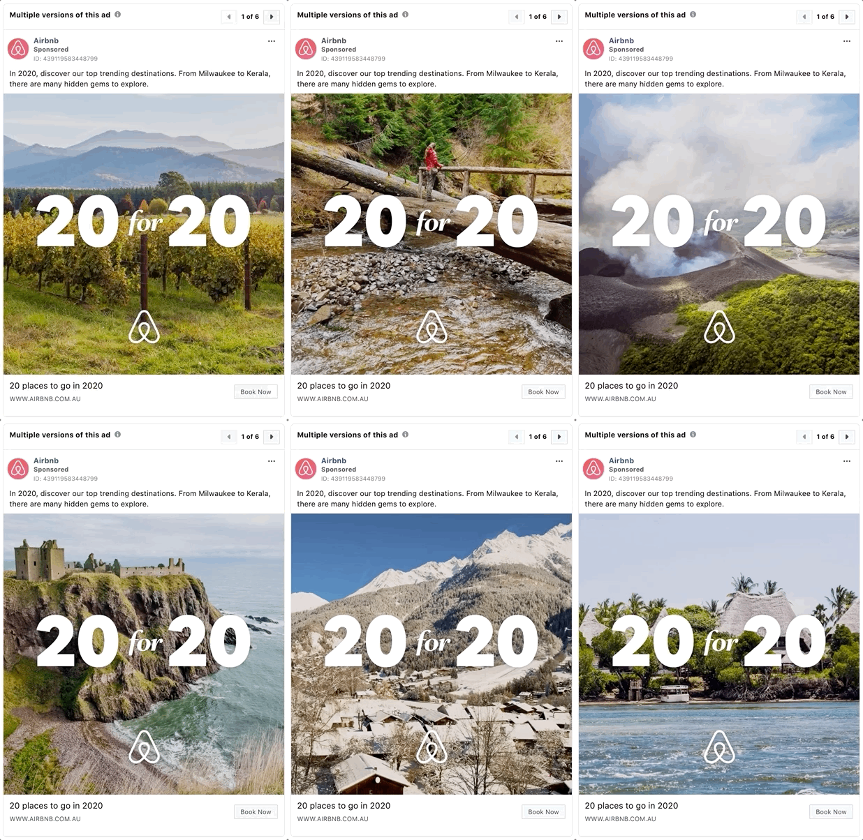
No one understands this better than travel brands, with a 77% of them using inspirational and educational ads at some point within their Facebook ad portfolio. Airbnb for example, try to inspire their audience to broaden their horizons, by showcasing a bucket list of possible destinations to align with the start of a new decade.
The best Facebook advertisers don’t act like advertisers, not in the traditional sense anyway. They understand that sales-based messages seldom cut-through without first investing time and effort in cultivating your audience. Inspirational content should be at the very forefront of the top of funnel for brands. Be a resource, not just another advertiser.
Amplify your happy customers.
Happy customers seldom become advocates, but when they do, it can be a beautiful thing. Social media is often the first port of call for consumers, when looking to share both their positive and negative buying experiences with friends and family.
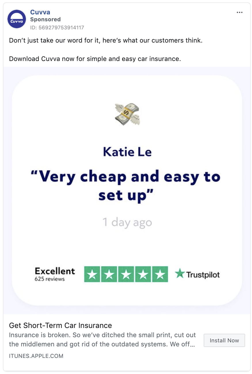
For example, 76% of finance brands analysed ran ads that had at least one social proof signal. Cuvva, a UK-based car insurance start-up, take this a step further – doubling-down on social proof, with a user generated quote accompanied by a prominent TrustPilot review rating.
Forward-thinking brands can leverage these interactions in a number of ways. Very simply, all ad creative should contain at least one element of social proof: testimonials, reviews and ratings, influencer endorsements, trust badges – they all count as social proof signals. These signals can be included within the description of the ad, or for best results overlaid on top of your image for maximum visibility.
Be also mindful that the social proof you’re using should be relevant to your target audience, and always be looking to test multiple forms of social proof against one another, in order to build your ads effectiveness over time.
Go head-to-head with competitors.
Sometimes, the direct route is the best option.
And when you’re a challenger brand in a competitive space, this approach makes even more sense.
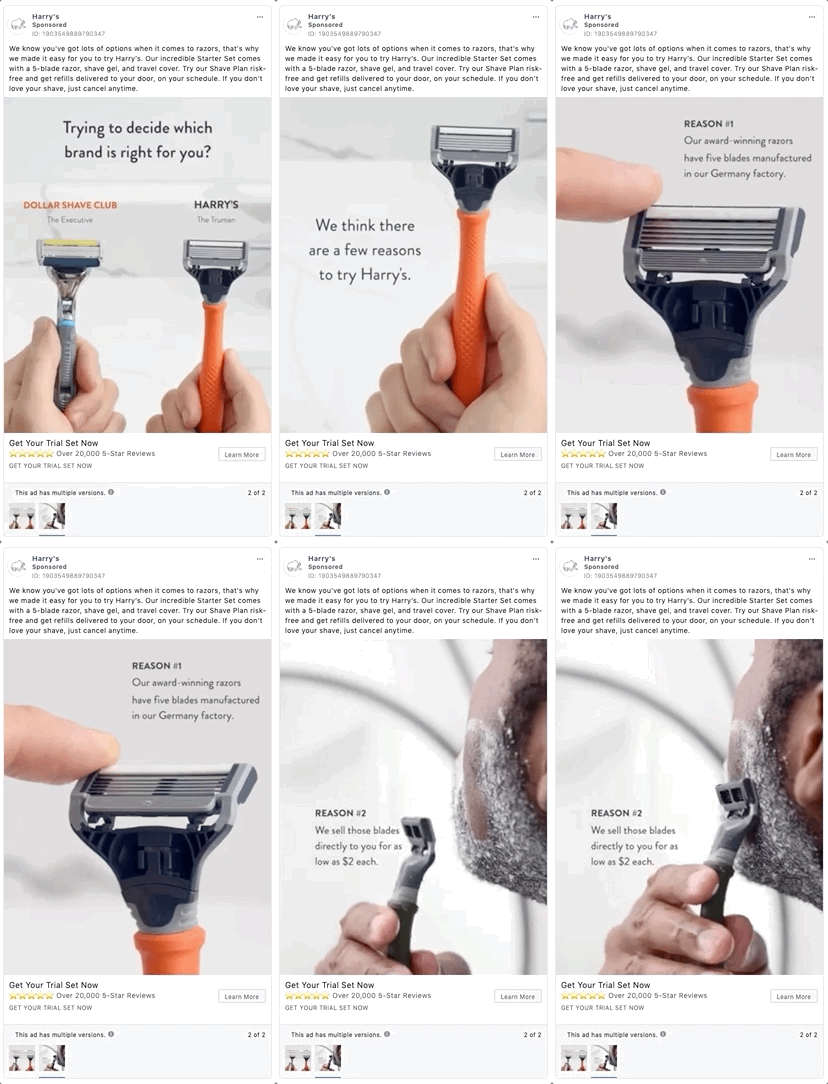
That’s why 57% of fast-growth retail businesses choose to go head-to-head with established competitors within their ad creative.
For example, shaving brand Harry’s provide a masterclass in competitive creative, with an entire campaign aimed at one of their main rivals, Dollar Shave Club. Not only do Harry’s offer several brand-specific reasons to choose their products, they also use video and social proof to enhance their message.
Throwing up a target can be an effective way to contextualise your message. A direct competitor comparison ad gives your audience a clear understanding of why your brand is best positioned to meet their needs. Tread carefully, as this are can risk retaliation, or in extreme examples even litigation. That’s why it’s best to stick to objective facts where possible, or even better, user generated content in the shape of customer social media posts where your brand comes off favourably.
Level up your Facebook customer acquisition
Get ahead with a Personalised Audit
Get personalised recommendations for improving your Facebook Ads performance.
Understand Your Digital Maturity
See how you compare to your peers and get your custom action plan to move up the digital marketing curve.
Learn and Grow with blimpp
Discover the latest growth insights and marketing tactics proven to increase ROI. Take your skills to the next level.
Facebook Creative Hub Tool
Create and share mock-ups for ads. Every format at your fingertips.
Facebook Ad Transparency Tool
The Ad Library provides a comprehensive, searchable collection of all ads currently running across Facebook.

